EkLine
A B2b web platform, copiloted with AI guidance in creating, reviewing, and maintaining seamless documentation.
Role
UX/UI Designer (Team of 5)
Tools
Figma
FigJam
Zoom
Google Drive
Slack
Notion
Duration
10 weeks
Process
Discovery/Research
Ideation
Design
Dev Handoff
Reflection
Understanding what EkLine brings to the table...
EkLine, a B2B AI platform, tackles inconsistent and outdated documents by optimizing the creation, review, and maintenance of business documents. By automating reviews, providing a no-code interface, and offering an end-to-end desktop solution, EkLine ensures documents remain consistent, accurate, and up-to-date to transform how businesses manage content.
The Challenge
The solution...
Here’s What We Achieved—See How We Got Here!
Our team enhanced navigation, usability, and style guide configuration through collaboration and client communication, supporting EkLine’s mission to optimize documentation workflows.
But first, we needed some answers...
The Client Clarified User and Business Requirements Through Direct Interaction.
We gathered and analyzed user and business requirements through direct client interaction, focusing on specifics like content for style guide screens, available presets, and reference examples.
Digging even deeper...
451 Research Revealed Knowledge Workers Favor Document AI for Better Productivity.
54%
Say automation helps get work done faster.
46 %
See it as a tool to save time for productive tasks.
41%
Value its consistency and fewer errors.
Research from S&P Global shows workers prefer AI tools like EkLine for productivity, time savings, and accuracy:

• Employee Engagement: Speeds up tasks and fosters creativity.
• GenAI Focus: The Work Execution survey showed a strong link between content, document tools, and work productivity.
How Might We Design AI-Powered Document Management Solutions that Align with User Preferences to Enhance Productivity, Efficiency, and Accuracy while Maximizing Usability and Output Quality?
Identifying our users’ needs...
I Took the Role of User Story #3: Creating New Style Guides.

As a user, I want to...

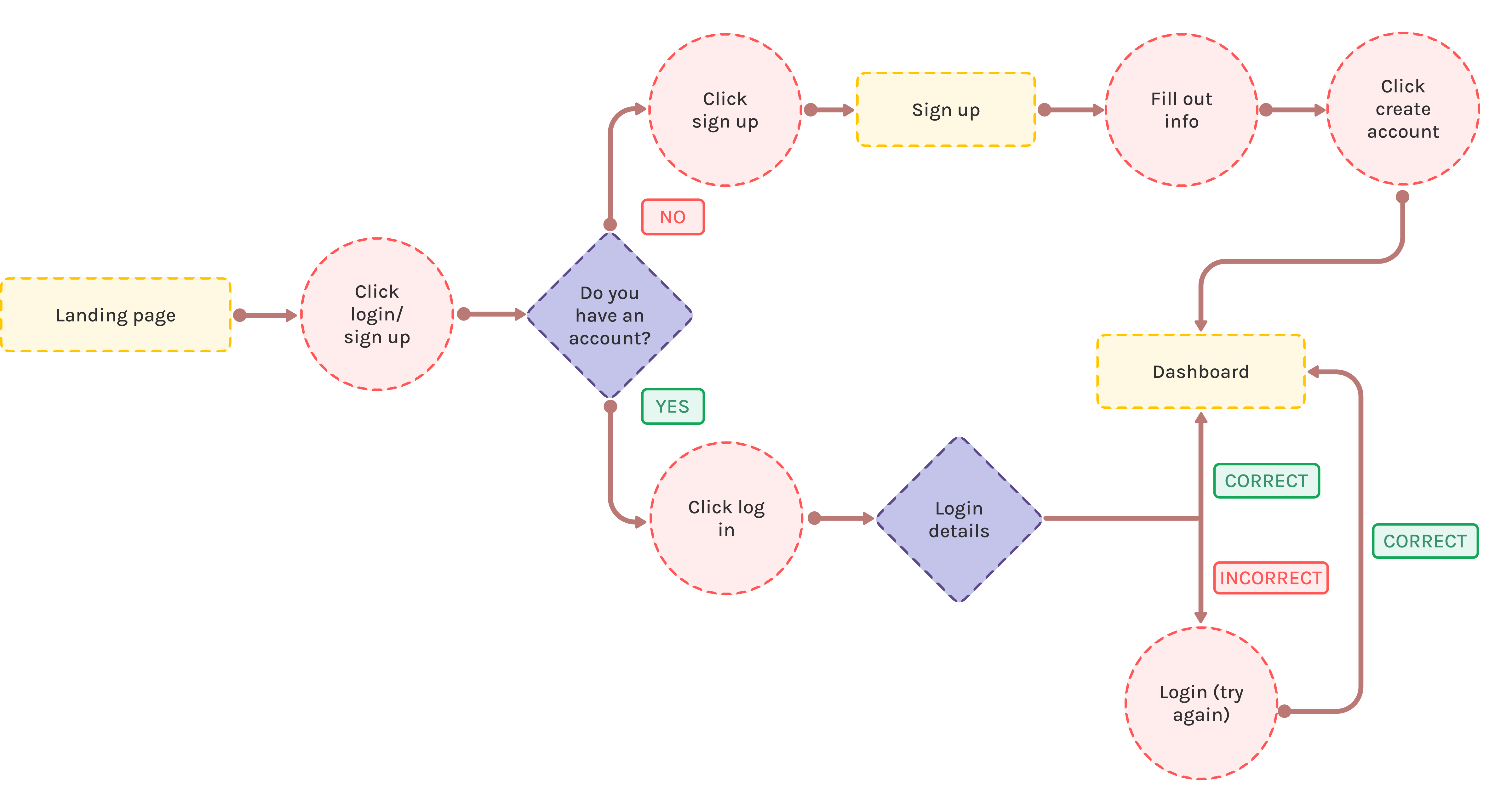
create an account and log in.

As a user, I want to...

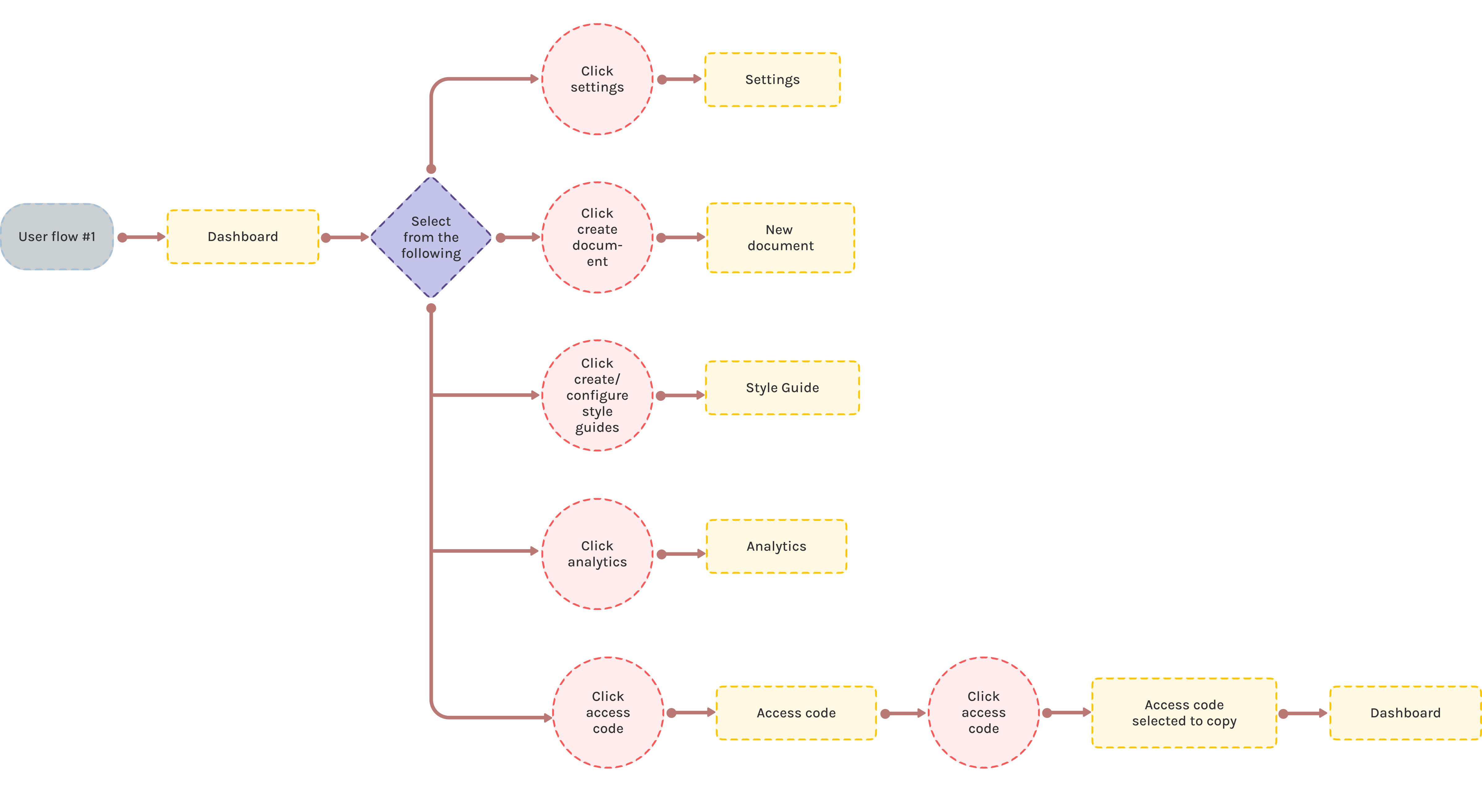
access my dashboard.

As a user, I want to...

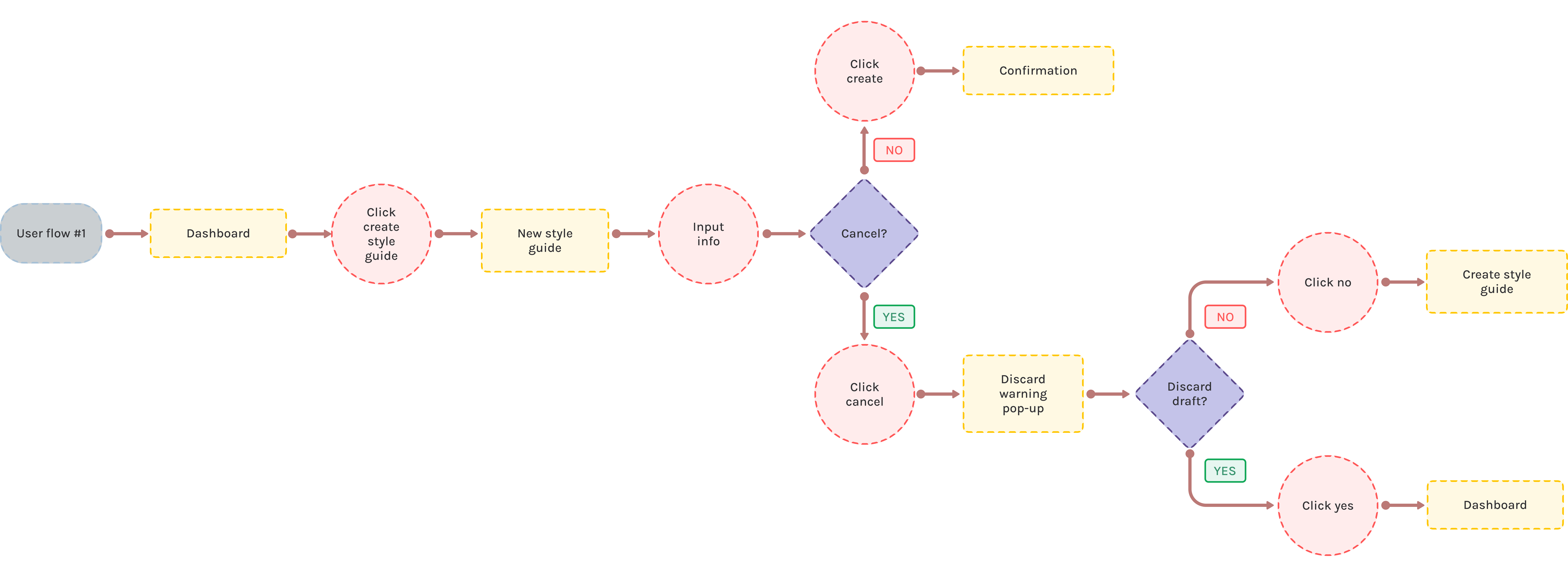
be able to create a style guide.

As a user, I want to...

configure the style guide and set the rules they want to follow.

Mapping out the flows...
So How Can I Guide Users in Creating New Style Guides?
Focusing on user story #3, I designed a user flow to simplify creating a style guide. Starting from the landing page, users follow a seamless login or sign-up process, which leads them to the dashboard to access the 'create style guide' feature.
Key:
Click to Zoom
I picked up a paper and pen...
With Ideas in Mind, I Sketched Out Concepts for the Dashboard and Style Guide Screens.
Low-fidelity wireframes...
I Translated my Sketched Ideas into Low-Fidelity Wireframes.
I designed templates for the login and sign-up screens, the dashboard, and the style guide creation screen, with extra focus on the style guide creation screen. I developed two distinct approaches tailored to how users can create a new style guide profile.
Medium-fidelity wireframes...
I Focused on Elevating the Wireframes of the Dashboard and User Flow #3.
Our medium-fidelity wireframes were designed with a consistent visual language, utilizing carefully chosen typography, icons, and imagery. We followed an 8-point spacing system to create a balanced layout. For the style guide creation, I added a progress bar, options to use Google or Microsoft templates, and the ability create from scratch. Key UI elements included warning prompts to prevent data loss and a summary screen for final review.
Iterations...
Our Team Created 3 UI Iterations of the Dashboard Screen for Client Selection.

Each team member developed UI iterations of the dashboard based on my initial medium-fidelity design, submitting our top three versions to the client. My iteration (#1) refined the original wireframe with improved visual flow, consistent brand colors, and better navigation. The client selected iteration #2 for its balance of aesthetics and usability, setting the direction for the remaining screens.

Iteration #1
Iteration #2
Iteration #3
Defining Ekline's branding...
I Solely Produced EkLine's Updated Style Guide.
I took the initiative to create a comprehensive style guide for the EkLine. In the style guide, I included the color palette, typography, icons and images, buttons, grid, and spacing.
Color Palette
Our team selected a color palette to support EkLine's functionality and emotional appeal. Bright Orange, Eerie Black, and Pure White served as vibrant primary colors, conveying energy and precision. Grayscale and accent colors enhanced information hierarchy and interactivity without overwhelming.
#231F20
#494949
#777373
#95A0A8
#EFEEE
#FFFFF
#4876F9
#008194
#B4C8FC
#BD2828
#FFH5656
#FFD8D8
#FF9333
#FFD3AD
#ECEFF5
#117F15
#E8F8E8
Typography
As for typography, we continued with the same typography style used by the previous design team to ensure brand recognition.
Headings
H1:
Open Sans, Bold, 48 px
H2:
Open Sans, Semi Bold, 32 px
H3:
Open Sans, Semi Bold, 28 px
H4:
Open Sans, Semi Bold, 24 px
H4:
Open Sans, Regular, 24 px
H5:
Source Sans Pro, Bold, 22 px
Body
B1 r:
Source Sans Pro, Regular, 20 px
B1 sb:
Source Sans Pro, Semi Bold, 20 px
B2 r:
Open Sans, Regular, 16 px
B2 sb:
Open Sans, Semi Bold, 16 px
Icons & Images
Icons were sourced from 'Phosphor Icons,' ensuring a consistent visual language across the interface. Similarly, images were selected from the 'Illustration Kit,' maintaining a uniform aesthetic and coherence in our design elements.
Buttons
Grid & Spacing
An overview of the key changes...
The Constant Communication with our Client allowed us to Refine our Designs as we Progressed.
We received iterative feedback that necessitated redesigns to meet the predefined usability and design benchmarks.
✰ Integration Usability
Before
After
✰ UI Improvements
I revised the Existing Style Guide interfaces to align with the established UI design, optimizing information layout and polishing UI elements for an intuitive user experience. To support first-time users, I added a pop-up explaining 'What is a style guide?' to provide immediate guidance and highlight the platform's value.
We applied the branding to the rest of our screens...
The Final Product
During this phase, we applied EkLine's brand identity across all screens, focusing on the screens for user flow #3. I emphasized visual hierarchy, alignment, and spacing to ensure a clean, structured interface. By integrating elements from the style guide, component library, and dashboard updates, I reinforced consistency for a polished design.
User Dashboard
I designed EkLine's dashboard for user efficiency, featuring an overview of key metrics—documents, style guides, and members. The style guide section boosts productivity while documents and analytics are organized for quick access to files and performance data, with intuitive navigation.
Existing Style Guides
We designed a dedicated interface to manage style guides, with tabs for the library, favorites, and archives for easy navigation. Settings are a click away, ensuring a user-friendly experience.
Create New Style Guides
I designed this screen for EkLine to simplify creating new style guides. Users follow a step-by-step process, starting with template selection—either a custom build or branded templates like Google and Microsoft.
Style Guide Configurations
Aligned with user flow #4, these screens enable users to customize style guides through configurable settings. Users can adjust spelling, grammar, tone, and voice with easy toggles, while the clear layout enhances rule categorization and personalization.
From designers to developers...
Our Project Was Finally Ready for the Developers!
As we wrapped up the project, I thoroughly measured and annotated each screen element, detailing dimensions, spacing, and other critical style attributes. For user flow #3, focused on the 'existing style guide' and 'create new style guide' screens, I took charge of detailing all aspects of the design. This included marking the margin, padding, dimensions, and the behavior of interactive elements.
My takeaways...
Team Work and Time Management.
Working with my team taught me the importance of finding common ground during disagreements. Instead of letting differences slow us down, we used open communication and debates to strengthen our designs and highlight each member’s unique strengths. Balancing the project with personal and professional responsibilities was challenging but rewarding. I broke the work into clear milestones and relied on tools like shared calendars to stay organized. This approach kept us on schedule and helped me manage my time without burning out.
Next Time.
Reflecting on the process, one area I’d focus on improving is testing our new designs to gather user feedback on accessibility and usability. While we incorporated feedback at various stages, diving deeper into iterative testing could have unlocked more nuanced insights into user behavior. Involving a broader range of users and refining our designs based on their input might have taken both accessibility and usability to the next level. Although user testing wasn’t part of this project’s scope, I now see how essential it is, and I’ll make it a priority in the future to ensure our designs truly meet user needs.
What’s Next?
This project has deepened my experience with AI-driven UX/UI design, helping me refine how I incorporate feedback into iterative cycles. Moving forward, I’m excited to explore AI’s potential further, while focusing on creating intuitive, impactful designs and navigating team dynamics effectively.