besti
Redesigning and amplifying a B2C web platform for cultivating, sharing, discovering, and celebrating businesses.
Role
UX/UI Designer (Team of 5)
Tools
Figma
FigJam
Zoom
Google Drive
Slack
Duration
7 weeks
Process
Discovery/Research
Ideation
Design
Dev Handoff
Reflection
A bit of background...
Uncover Local Spots Shared with Genuine Love.
besti is a unique B2C platform that offers an alternative to Yelp, allowing users to share their preferred locales and spaces in an environment free of negativity and advertisements. It allows users to explore and recommend dining options based on genuine affection and positive experiences, making it an inviting space for food lovers to uncover local and hidden delights without the common pitfalls of traditional review platforms.
Find Your Ideal Spots
Our carefully curated selections are based on real experiences, offering you true insights to find your perfect restaurant.
Save time and stress with our expert curation—no more sifting through countless average options.
Elevate Your Search
Fuel Small Businesses
We support small businesses, boosting word-of-mouth advertising, fostering connections, and driving community growth.
The problem...
besti was in need of a Revamp and the Addition of Fresh Interfaces.
besti's commitment to positivity and genuine sharing motivated me to take on a significant challenge. The client's vision was for a thorough website revamp, starting with the homepage makeover and filling in the gaps to enrich besti's digital footprint. It became apparent that besti's platform lacked key components, including an about and services page, a feature for exploring businesses, a blog page, and options for social media sharing. This required not just a redesign, but also the development of new features and screens that would resonate with besti's mission and brand guidelines.
The solution...
We Transformed besti’s Desktop Site to Fully Embody its Mission of Fostering Connections.
To enhance besti's desktop site, my team and I addressed the client's request by updating the home screen to reflect the warmth of besti's mission. From there, we developed a consistent design theme across the about us page, services page, and search listings for businesses and restaurants, incorporating easy social media sharing options and a custom blog page. Each element emphasizes besti's commitment to fostering authentic relationships and creating an inviting digital space.
Some clarifications...
We Asked Targeted Questions to Understand the Client's Vision, and Gained Clear Insights.
We compiled an extensive list of client-focused questions to drive us to understand the company's essence from every angle. I focused on asking about the precise content and features the client envisioned for the homepage,  as well as their preference regarding the separation of the services page from the about me page. Our approach to questioning led to direct answers from the client which provided us with insights into their exact needs and expectations.
What CTAs would you like us to include?

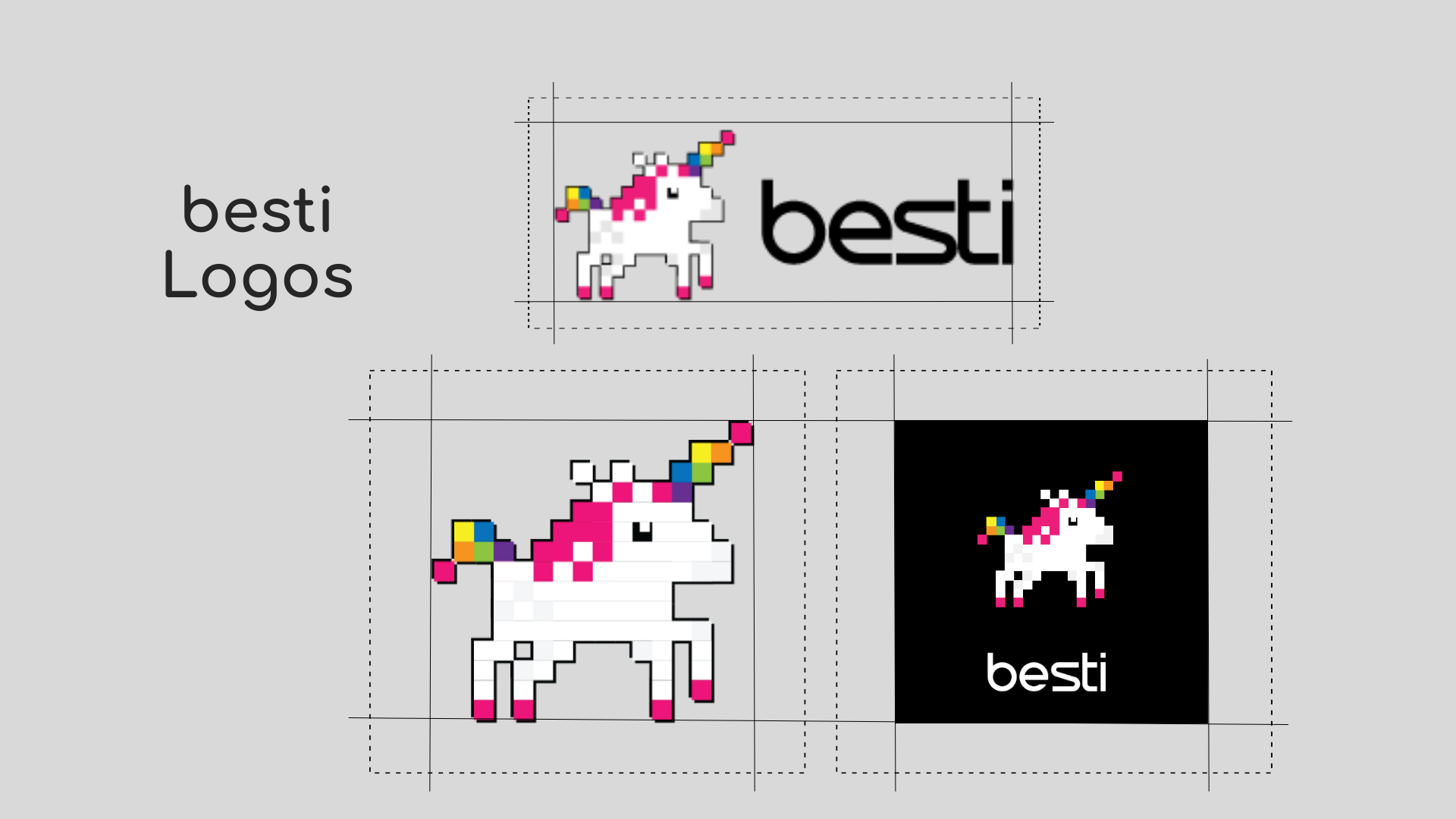
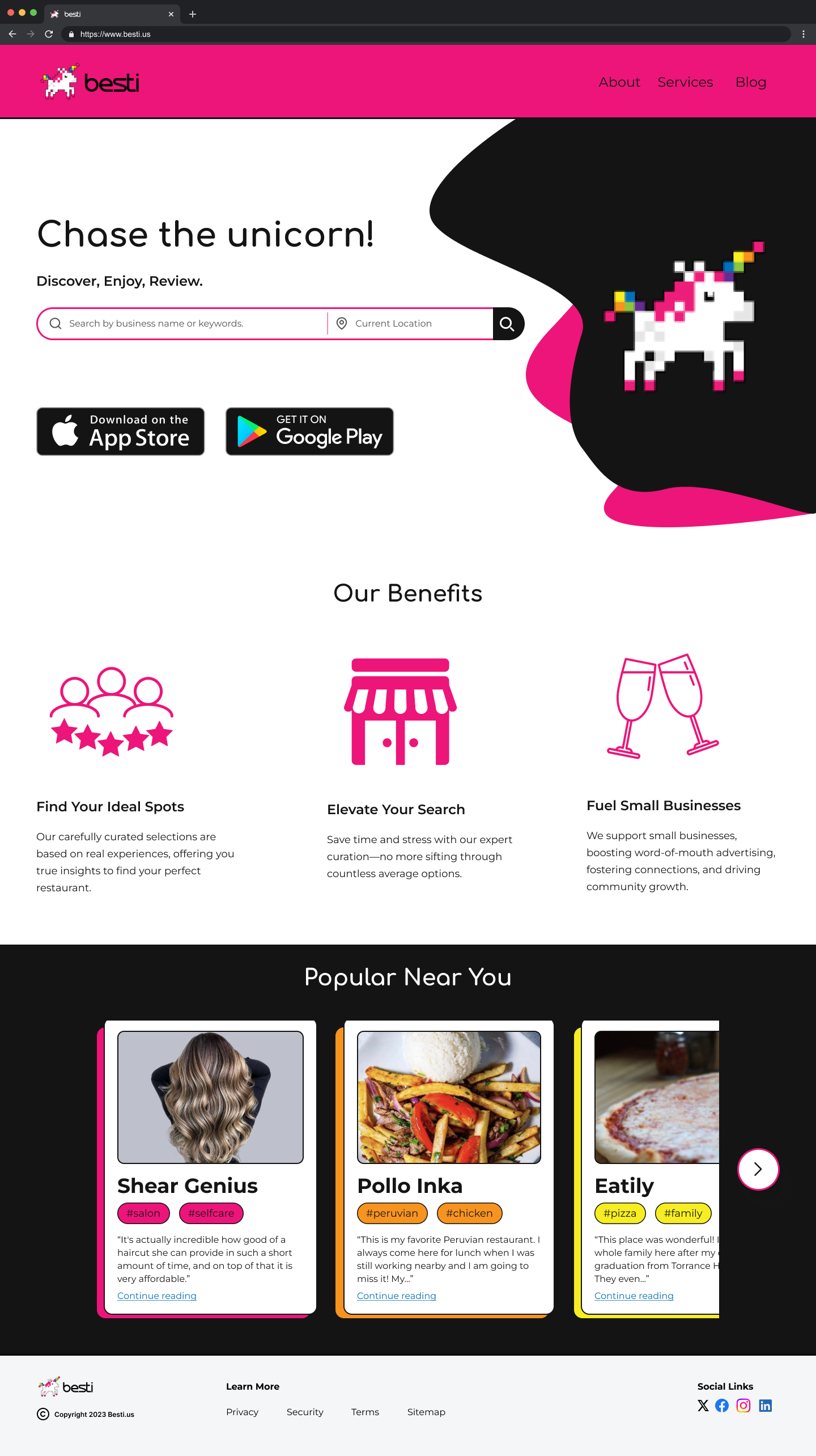
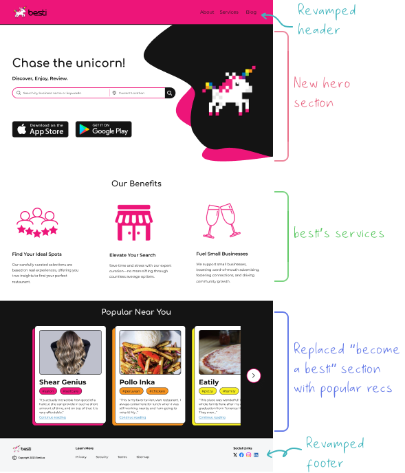
"We have been using "Chase the Unicorn" in some marketing materials. That could work."

What content do you want on the homepage?

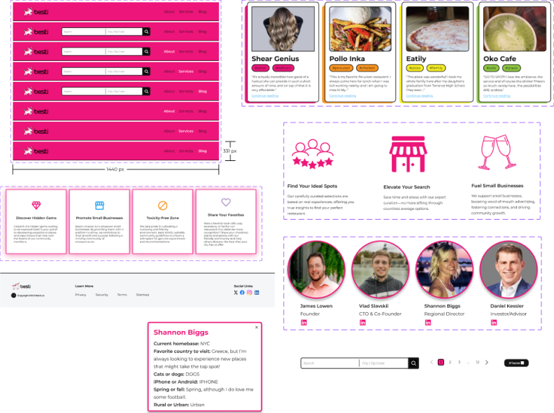
"Very little. The links to the app stores, and not much more than that. The bottom sections of the homepage can be removed entirely."

Would it be better to have a separate tab and screen for "Meet the Team"? Or should it be included as part of the About Us page?

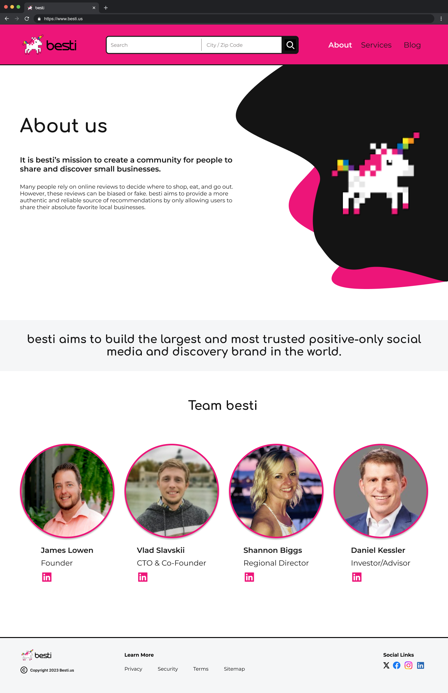
"Since we are small, we can keep it all on the About Us page."

User flow 3 states, "As a user, I want to learn more about besti's services." Would this information be included on the About Us page?

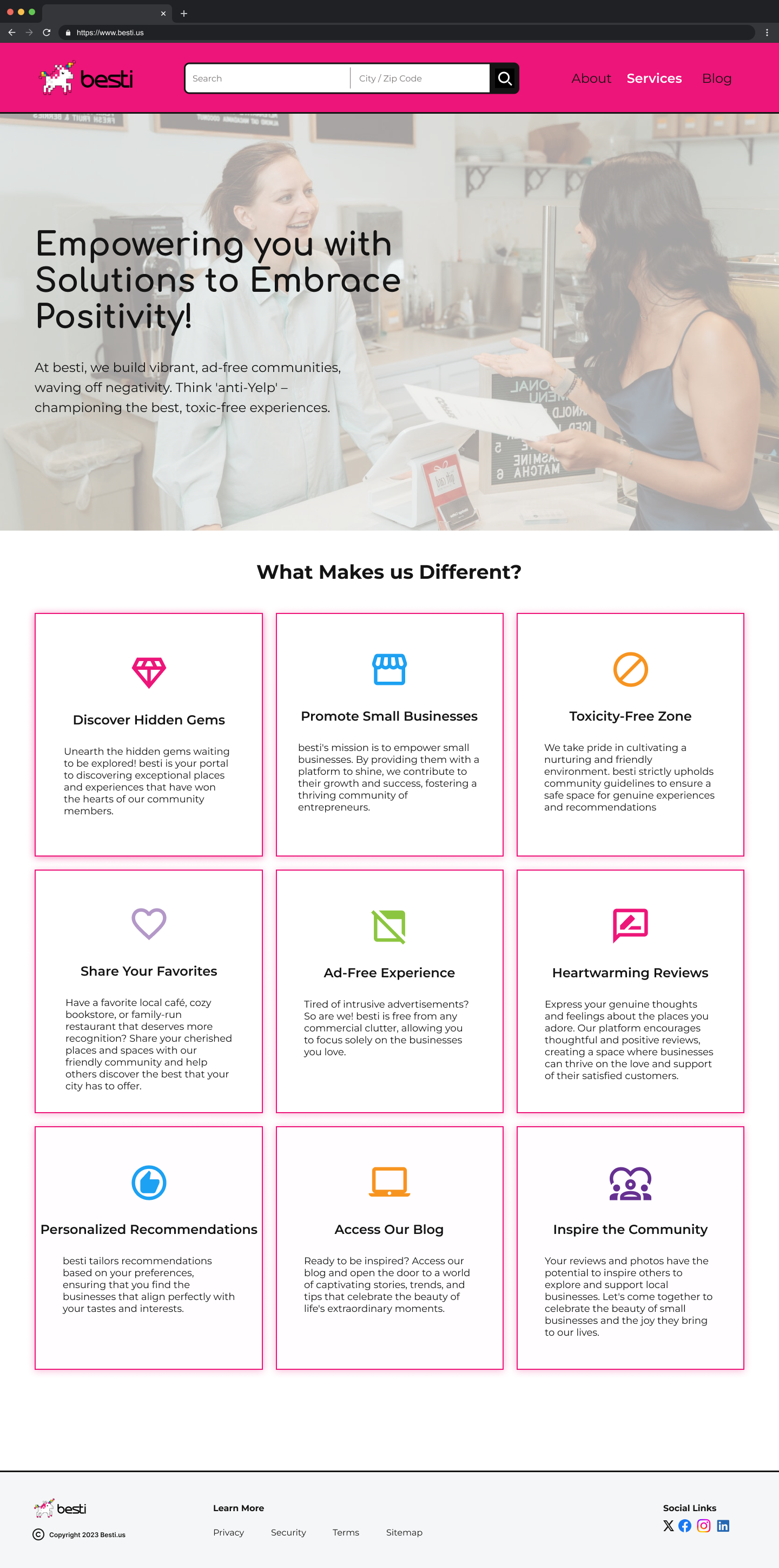
"Probably make it a separate page that details our business offerings. About us should focus on the team and our story."

Heuristic evaluation...
What Errors needed to be Addressed on the Current besti Website?
We created a heuristic evaluation that involved a comprehensive analysis of the existing website to pinpoint potential usability concerns within the interface. During this process, I prioritized addressing any website accessibility and consistency issues. Here is what we uncovered:
Competitive analysis...
What Do Some Competitors Look Like Compared to besti?
So what do users need?...
I Was in Charge of User Story #3: Exploring besti’s Services.
Our client provided us with six key user stories that highlighted their requirements and expectations. We distributed these stories among the team members and my role involved developing user story #3, focused on besti's services.
User flows...
What Approach Can I Take to Guide users Through besti's Services?
Based on the user stories, we detailed user flow diagrams. Focusing on user story #3, I outlined a step-by-step path that begins with users landing on the home screen after opening the website, followed by a click on the “services” tab that takes them directly to the service page.
1. As a user, I want to learn more about besti from the homepage.
2. As a user, I want to learn more about besti and the team.
3. As a user, I want to learn more about besti's services.
4. As a user, I want to be able to search for restaurants and businesses from the homepage.
5. As a user, I want to be able to share a restaurant or business I found on my social media accounts.
6. As a user, I want to access a blog and be able to share a blog post on my social media accounts.
Key:
Some guidance...
The Client Provided a Brand Guide for our Design.
Our client provided us with a detailed brand guide that included Besti’s mission, vision, color palette, typography, and comprehensive guidelines. We used this resource consistently throughout the project, ensuring it shaped our design choices.
Low-fidelity wireframes...
We Built the Foundation with Initial Wireframes.
We created low-fidelity wireframes, outlining basic layouts and features for each screen. I developed the initial wireframes for the homepage and services page, focusing on placement and functionality.
Medium-fidelity wireframe...
Client-Centric Design Refinements.
In the medium-fidelity wireframe phase, we refined spacing, alignment, and padding. I worked on the header, footer, and search bar designs, as well as designed engaging text for the services page. This stage allowed us to gather early client feedback, leading to adjustments like consistently using "besti" in lowercase and removing irrelevant categories such as "restaurants" and "salons." Our iterative process demonstrated our commitment to client satisfaction and design flexibility.
Style guide...
We Created a Style Guide Using the Brand Guide and Design Concepts.
Using key details from the client's brand guide, our style guide included the color palette, typography, iconography, spacing guidelines, layout grids, button designs, and UI component definitions.
Color Palette
We utilized the color palette provided by the client.
Typography
Typography was also provided by the client.
Iconography
Buttons
Grid & Spacing
UI Components
High-fidelity wireframes...
We Added besti's Personality to the Rest of Our Designs!
Our design process led to the creation of high-fidelity screens, with combined insights from our style guide and iterations. My focus was on the services page, targeted to:

• Create an engaging, informative experience
• Maintain visual consistency in hero text
• Include a hero image for visual emphasis
• Use service cards to present key information in an attractive UI
Home, About, & Services
Searched Results
Social Media Share
Blog & Share
Redesigns...
★ The Home Screen was Redesigned with a Bold Look, a Search Bar, and a Simplified Layout for Better Content Exploration.
The redesigned besti home screen featured a bold look, combining black and pink for visual impact. A prominent search bar in the hero section improved usability by allowing quick content searches. Removing the "Become a Member" section simplified the homepage, emphasizing content exploration over sign-ups to boost visitor engagement and retention.
Before
After
The About Us Page was Updated to Focus on besti's Mission and Team.
Simultaneously, we recognized the importance of the About Us page. This section provided a platform for besti to communicate its mission, values, and unique selling points. The original lengthy introduction was shortened for better accessibility, and besti’s main goal was added to communicate the company’s mission. Additionally, the "besti team" section was redesigned with a cleaner appealing layout to highlight the team members and their roles.
Before
After
Developer handoff...
The Designs Were Ready for Handoff!
In the final phase of the project, I prepared developer handoffs with precise measurements using the Figma plugin Redlines and Annotations to ensure clear communication and alignment with design objectives.
My takeaways...
Design Adaptation: Aligning Vision with Client Needs.
The redesign for besti emphasized the importance of merging creativity with clear communication, allowing us to effectively transform complex client needs into compelling design solutions. Working on this project highlighted a crucial lesson: my personal design preferences may not always align with the needs of the client or their users. Initially, adapting my style to fit the client's vision was challenging. However, this experience taught me the value of flexibility and the importance of designing with the client’s and users' perspectives in mind. It was a constructive journey that broadened my understanding of effective design practices.
Next Time.
Looking ahead, I aim to enhance the initial planning phases to better anticipate and address potential design challenges. This involves setting clearer milestones and integrating regular check-ins with the client to ensure alignment at every step. Improving these areas will streamline our design process and foster even stronger client relationships.
What’s Next?
I am excited to carry the lessons learned from this project into future work. Embracing continuous learning and adapting to new design challenges will be my focus. By pushing creative boundaries and refining my design approach, I plan to deliver outstanding solutions that consistently exceed client expectations.